
Bringing sites into ADA compliance involves evaluating all aspects of a site, both visible and invisible to users. While web developers focus more on the “behind the scenes” work that goes into ADA compliance, designers ensure the visual interface doesn’t create barriers for people with disabilities.
Accessibility and good design go hand in hand. Very often, designing to meet WCAG guidelines for accessibility helps create a better user experience for people of all abilities. It’s also a good exercise in learning to see the world through the eyes of others. For example, many people might not think twice about how to use a datepicker widget, but some styles of datepicker widgets could be difficult to use for people with cognitive disabilities, mobility issues, or vision impairments. Once you know what to look for and what to think about, you might be surprised by how often you can find design elements that don’t meet guidelines for ADA compliance, even on some very popular websites.
ADA Compliance Guidelines for Website Design
[color image]
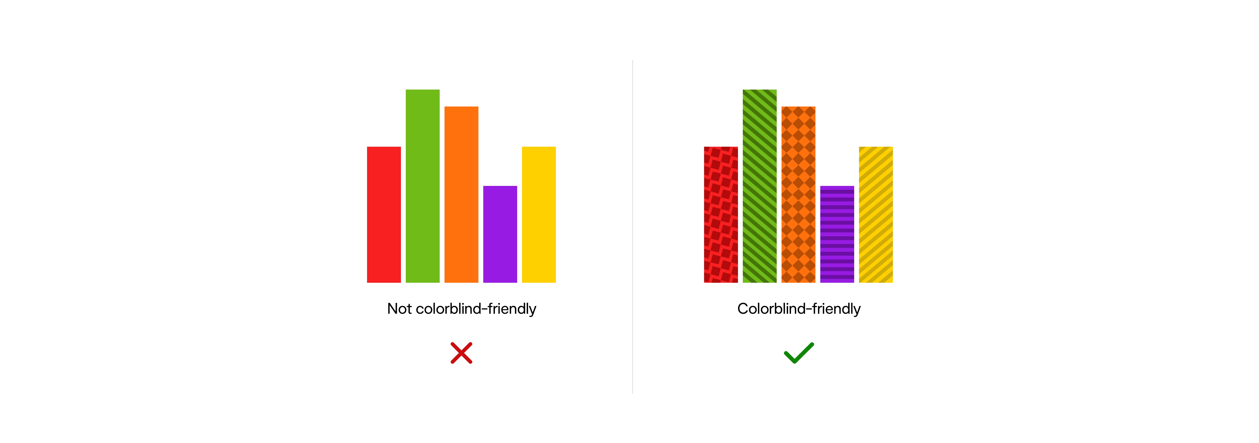
Color
Color can be an extremely effective way to convey information to people. But when it comes to web design, it can’t be the only way you send a message because users with colorblindness or using screen readers can miss out on any meaning tied to that color. For example, links on a page should be underlined instead of simply making them a different color from the rest of the text on a page.
Charts are a good example of how color can be tied to a very specific meaning and how misunderstandings could potentially occur. If solid colors were used to represent different groups in a chart, a person with colorblindness might have a hard time telling the difference between the groups.
Forms are another way this could come into play. For example, let’s say someone fills out and submits a form and there is an error in one of the fields. That field could be outlined with a red border to let users know where the problem is, but a red border alone would not be considered ADA compliant. Instead, something like an icon of an X should be placed next to the field to clarify where the error is. A text-based message should also note the error and give users direction on how it should be fixed.
[form image]
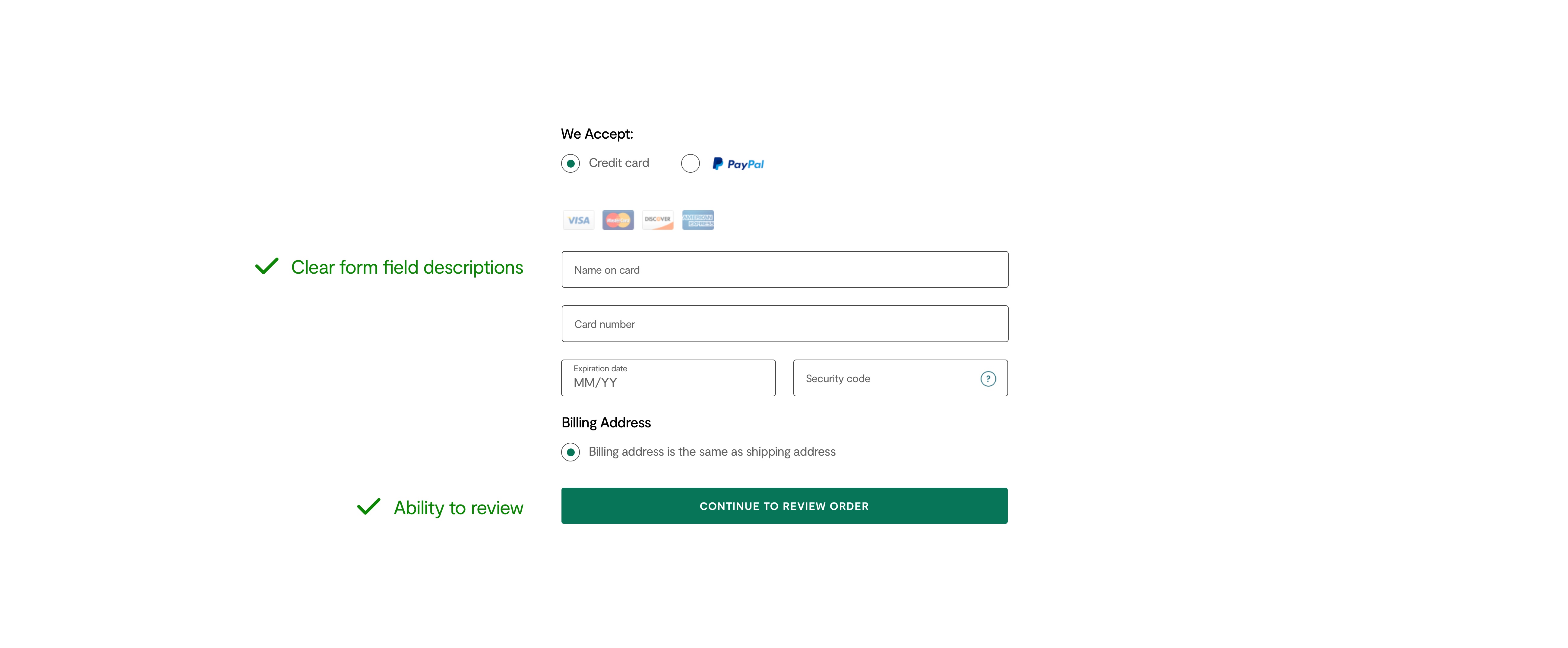
Forms
Speaking of forms, WCAG guidelines also require all forms to be clearly labeled to indicate which information is needed in each field. If a form submission involves important information or a significant commitment on the user’s end, such as making a purchase or entering into a legal agreement, the form needs to include the ability to review and correct information before submitting it, a way to reverse a submission, or another way to correct errors. Form fields should also have visibly defined borders to make it easy for users to understand where exactly those fields are.
[contrast ratio]
Contrast Ratio
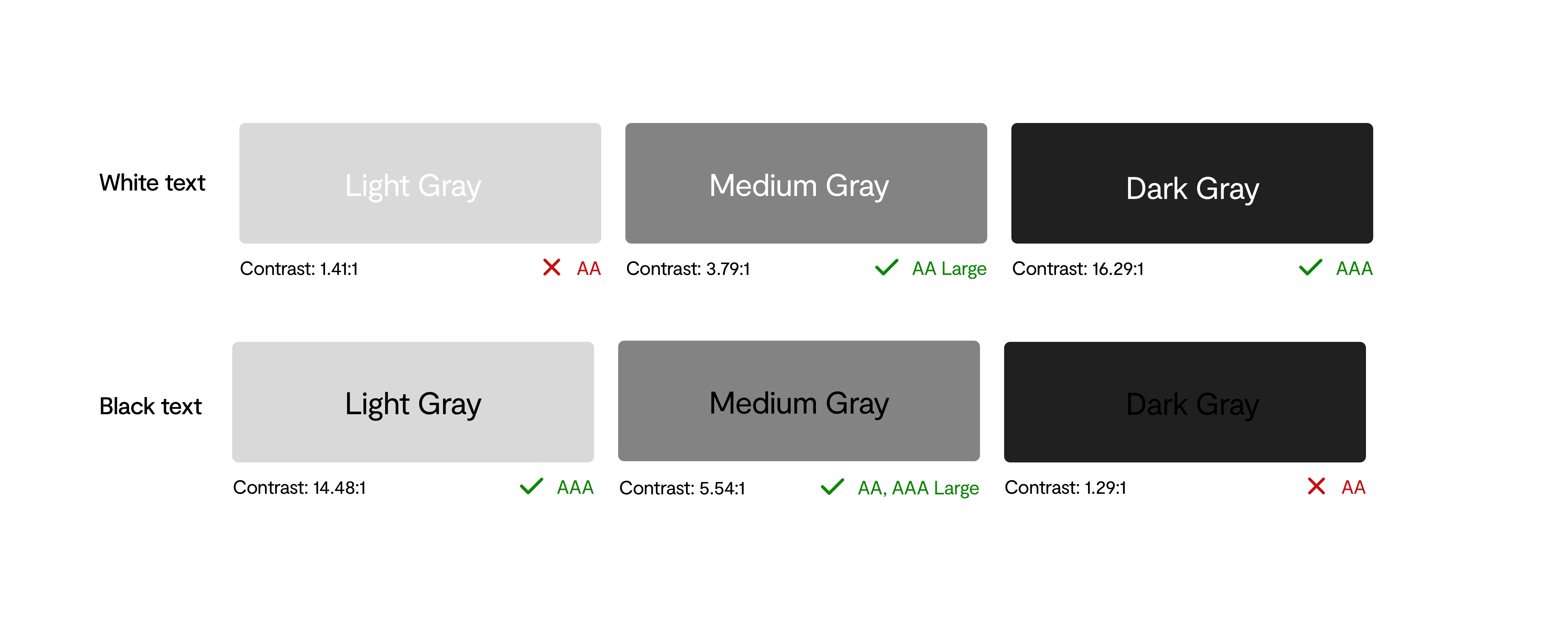
Contrast ratio is a prime example of how designing for accessibility can lead to a better experience for everyone. Whether you have impaired vision or 20/20 vision, light text on a light background or dark text on a dark background can be extremely difficult, if not impossible, to read. A low contrast ratio can be made even worse when viewed on a mobile device in a bright setting. WCAG guidelines for AA-level compliance require a minimum contrast ratio of 4.5:1 between text and the background, but that ratio can be as low as 3:1 for larger fonts, with “large font” defined as being at least 18 points or 14 points if bolded.
It’s important to note that contrast ratio doesn’t just apply to text. Important graphic elements like icons should also be designed to meet proper contrast ratio standards.
[text in images image]

Text in Images
Whenever possible, text should be kept out of images. Since screen readers are not able to interpret text that’s part of an image, that text would be inaccessible to users with vision impairments. Users also might not be able to enlarge images as much as they would be able to enlarge regular text without losing picture quality. If you want to feature something like pull quotes on a page, CSS can be used to stylize text instead of using images of the quotes you want to feature. There is an exception for text that is part of decorative images, such as text that is part of a logo.
If you aren’t supposed to include text in images, does this mean that infographics aren’t ADA compliant? Not necessarily. You can still create infographics, there are just a few things that need to be considered. As is the case with other graphics and the overall design of a site, infographics need to be designed with ADA guidelines in mind to include things like proper contrast ratio and readable fonts. A text transcript or HTML version of the infographic should also be available so that the content of the image can be understood by a screen reader.
[spacing/organization]
Text Organization & Spacing
Users of all abilities will also appreciate content that’s presented in a way that’s clear and easy to understand. If content is organized in a way that doesn’t make logical sense with clear section headings, the page might not be interpreted correctly.
No matter how helpful the content on a page is, if the text spaced too tightly, people will likely give up quickly and look elsewhere for the information they need. Users with certain types of disabilities might not be able to understand content with minimal line spacing. WCAG Level AA compliance guidelines for text spacing are:
- 1.5x the font size for line height
- 2x the font size between paragraphs
- 0.12x the font size for letter spacing
- 0.16x the font size for word spacing
[san serif images]

Fonts
Fonts play a very important role in accessibility, but there currently isn’t an official list of ADA compliant fonts or even specific guidelines for choosing fonts. Generally speaking, clean and simple fonts are considered the most accessible, such as Times New Roman, Arial, Helvetica, Calibri, Verdana, and Tahoma. More ornate fonts may be visually striking, but they might also be problematic for people with vision impairments or cognitive disabilities.
If you’re trying to choose between a serif and a sans serif font, sans serif fonts are recommended for web design. Sans serif fonts tend to be more readable on digital screens and many organizations recommend sans serif fonts for those with dyslexia.
In terms of font size, there isn’t any one specific answer about how large fonts should be. People can have very widely varying needs based on their eyesight, and since tools like screen magnifiers can be used for individual control, there is some flexibility with font sizes. We typically use 16 point fonts for body paragraphs and long-form content.
Blog_Layout and navigation.mov
Layout & Navigation
Since users might need to interact with a site in different ways, they should have different options for navigation. Overall site navigation should be consistent, but features like breadcrumbs and search bars can help make it even easier for people to find the information they’re looking for. When people are navigating a site by using a keyboard, focus indicators should appear around elements like images and links to help users clearly see where they are on the page. Remember that a “Skip Navigation” option also needs to be included for users who are using a keyboard.
Blog Animations.mov
Graphics, Animations & Other Media
User control is a key part of meeting WCAG guidelines for many types of media. When you have image carousels, audio, or video on a page, people need to have a way to control that media so that they can interact with the site in the way that works best for them. In the case of animations, care needs to be taken to make sure they don’t move so quickly that people aren’t able to understand them. If an animation or video involves a message, it needs to be visible for enough time for people to be able to read it.
It’s also important to make sure that graphics, animations, and videos won’t cause problems for photosensitive users. If you have any animations or videos that involve flashing lights, they shouldn’t flash more than three times per second to prevent triggering seizures.
Is Your Website Design ADA Compliant?
For more information on ADA compliance, check out our blog post about ADA compliance for web developers and stay tuned for our post about ADA compliance and SEO. We also offer ADA compliance auditing and remediation as one of our web development services, so contact us if you’d like us to take a look at your website today.